A Simple To-Do List

I feel pretty confident when it comes to HTML(5) and CSS(3), but when it comes to JavaScript I’ve always found myself pretty lost. Sure, I can write small snippets, modify a code block hear and there, but I’ve never really drilled any deeper. But a couple of month back I decided it was time to take on the challenge by signing up on Treehouse. I’ve worked myself through two courses so far and I must say that I’m really impressed how professional the content is. Each course have been very easy to follow.

Anyway. After these two courses I felt it was time for a break to see what I could come up with on my own. So I decided to create a to-do list. I know, how original of me …

I kept the scope small.
– It had to be possible to add and remove items from a list.
– Each item should be stored, even when the tab or browser is closed.
– No design requirements other then it should look like a to-do list.
– The code had to pass jshint validation.

Demo:

See the Pen
ToDo-List
by Christofer Vilander (@c_vilander)
on CodePen.


Since this isn’t a tutorial I won’t go into detail on how it was created. Feel free to look at the code if you want. But there is one tricky part I want to touch upon in this post. How I solved storing …

Since the to-do list would be more or less useless if the items weren’t stored I had to find a solution for this. My first thought was to use cookies, but after some reading I choose to use local storage instead. Local storage lets you store data, locally, in the browser. Simple and clever, but there are security implications with this approach, which you can read about here. I also might add that my solution isn’t fully optimized and there are surely better ways to do this.

Looking at the importent parts in the code

Before we jump into the code I just want to add what happens when you enter a text into the input field and click add.

1. A list item is created.
2. The value from the input field is stored in an array called ‘listBucket’.
3. The function storage() is executed.

The storage() function is pretty straight forward. When the function executes it stores the array. One thing to point out though is that you can only save strings into local storage which is why I’ve used JSON.stringify. The principle is pretty much the same when you delete an item. The deleted item gets removed from the array and the storage() function is run again.

// Stores the array 'listBucket' in localStorage.

function storage() {
localStorage.setItem('savedItems', JSON.stringify(listBucket));
}

The next part is how I restore the data. If you for example reload the to-do list the function printStorage() is run. This function gets the data and prints out the list items one by one using a for loop.

// Creates a list of what's stored in localStorage.

function printStorage() {
var getData = localStorage.getItem('savedItems');
var items2 = JSON.parse(getData);

for (var i = 0; i < items2.length; i++) {
var li = document.createElement('li');
listBucket.push(items2[i]);

li.appendChild(document.createTextNode(items2[i]));
todoList.appendChild(li);
li.setAttribute('id', 'list' + i);

li.onclick = itemDone;
console.log(listBucket);
}
}

And that’s about it. Like I said, this wasn’t a tutorial and there are better ways to solve this so please don’t use this code in a live environment.

My quest to learn JavaScript continues …
Singel HTML Element Heart

Since it is Valentine’s Day. Here’s a single HTML element of a heart that I’ve created.

HTML

<div class="heart"></div>

Without going into any details. What makes it possible to create a shape like this, with just one HTML element, is the use of the :before and :after pseudo-elements.

CSS

html, body {
background: #000;
width: 100%;
height: 100%;
margin: 0;
padding: 0;
}

.heart {
position: absolute;
left: -50px;
top: 0;
bottom: 0;
right: 0;
margin: auto;
width: 80px;
height: 100px;
background: transparent;
border-top-left-radius: 950px;
border-bottom-left-radius: 1300px;
transform: skew(0deg,15deg);
box-shadow: rgba(230, 76, 69, 0.8) -7px -3px 10px -2px;
}

.heart:before {
position: absolute;
top: -18px;
left: 62px;
width: 100%;
height: 100%;
content: '';
background: inherit;
border-top-right-radius: 950px;
border-bottom-right-radius: 1300px;
transform: skew(0deg,-30deg);
box-shadow: rgba(230, 76, 69, 0.8) 7px -3px 10px -2px;
}

.heart:after {
position: absolute;
top: 10px;
left: 20px;
width: 0%;
height: 0%;
content: '#';
color: #000;
font-size: 70px;
transform: skew(-1deg,-15deg);
text-shadow: 72px 4px 3px rgba(230, 76, 69, 0.8);
}

‘Play’ and ‘Reverse’ an Animation

As a part of the Web Animations spec, Chrome 39 has added a set of playback control features which, for example, makes it possible to pause(), and reverse() web animations. Interesting of course, and since I’ve written a post where I played around with the element.animate() function I had to give this a try as well.

But please note that this isn’t a tutorial and the demo might contain errors since it’s created in experimental purpose.

Basically what I’ve done is an animation that you can play and reverse. Make sure that you are using Chrome 39+ when you view the demo.

Demo

JS

(function () {

var box = document.getElementById('box'),
start = document.getElementById('start'),
reverse = document.getElementById('reverse');

start.addEventListener('click', function() {

var player = box.animate([{
transform: 'rotate(0deg)' + 'scale(1.0)'
}, {
transform: 'rotate(180deg)' + 'scale(1.4)'
}, {
transform: 'rotate(360deg)' + 'scale(1.0)'
}

], {
duration: 1000,
iterations: 1

});
reverse.addEventListener('click', function() {
player.reverse();
}, false);

}, false);

})();

Bouncing Buttons, a Demo

I was browsing through my old demos on CodePen the other day and I found this little experiment. It’s a menu which opens with a bounce effect. It might not be the best of menus from a UX point of view, but on the other hand – I created it just to be able to play around with CSS Animations.

The demo uses a tiny bit of JS to open and close the menu and CSS Animations for the bounce effect.

Blog Stats, August 2014

It’s time for one of these ‘not so interesting for you, but interesting for me posts’.

Looking back at the August numbers was fun, simply because my latest post ‘Experimenting with the element.animate() function‘ was featured in codrops COLLECTIVE #128 which created a traffic spike.

New vs Returning Visitors
New: 91,4%
Returning: 8,6%

Top 5 Countries (based on sessions)
1. United States
2. Germany
3. France
4. Sweden
5. United Kingdom

Top 5 Browsers (all versions)
1. Chrome
2. Firefox
3. Safari
4. Safari (in-app)
5. IE

… 13.62% didn’t have Flash installed/support.

Top 5 blog posts (based on sessions):
1. Experimenting with the element.animate() function
2. How to maintain the end state in a CSS Animation
3. Animated Submit Buttons
4. Web Development Tools and Resources
5. Tracking Across Synced Devices

Experimenting with the element.animate() function

Here’s a short blog post with two simple demos that I’ve created when playing around with the new element.animate() function that was included in Chrome 36, a function which makes it possible to create CSS animations using JavaScript.

Please note that this isn’t a tutorial and the demos might contain errors since they are created in experimental purpose.

As a comparison, the first demo is created strictly using CSS animations and in the second demo I’ve used the element.animate() function.

Demo One, CSS Version

HTML

<p>Hover over the box ...</p>

<div id="box"></div>

CSS

html, body {
width: 100%;
height: 100%;
margin: 0;
padding: 0;
text-align: center;
background: #eee;
}

p {
font: lighter 24px "Helvetica Neue", sans-serif;
color: #222;
letter-spacing: 2px;
}

#box {
position: absolute;
left: 0;
top: 20px;
bottom: 0;
right: 0;
margin: auto;
width: 75px;
height: 75px;
border-radius: 15px;
border: 1px solid #222;
}

#box:hover {
-webkit-animation: rotate 2s linear 2 ;
animation: rotate 2s linear 2;
}

@-webkit-keyframes rotate {
0%   {-webkit-transform:rotate(0deg) scale(1.0);transform:rotate(0deg) scale(1.0);}
50%  {-webkit-transform:rotate(180deg) scale(1.4);transform:rotate(180deg) scale(1.4);}
100% {-webkit-transform:rotate(360deg) scale(1.0);transform:rotate(360deg) scale(1.0);}
}

@keyframes rotate {
0%   {transform:rotate(0deg) scale(1.0);}
50%  {transform:rotate(180deg) scale(1.4);}
100% {transform:rotate(360deg) scale(1.0);}
}

Demo Two, JS Version

Requires Chrome 36+ to work.

HTML

<p>Hover over the box ...</p>

<div id="box"></div>

CSS

html, body {
width: 100%;
height: 100%;
margin: 0;
padding: 0;
text-align: center;
background: #eee;
}

p {
font: lighter 24px "Helvetica Neue", sans-serif;
color: #222;
letter-spacing: 2px;
}

#box {
position: absolute;
left: 0;
top: 20px;
bottom: 0;
right: 0;
margin: auto;
width: 75px;
height: 75px;
border-radius: 15px;
border: 1px solid #222;
}

JS

(function () {

var box = document.getElementById('box');

box.onmouseover = function () {

box.animate([{
transform: 'rotate(0deg)' + 'scale(1.0)'
}, {
transform: 'rotate(180deg)' + 'scale(1.4)'
}, {
transform: 'rotate(360deg)' + 'scale(1.0)'
}

], {
duration: 2000,
iterations: 2

});

};

})();

As you can see both demos are more or less working the same, except that the animation in the CSS version will break (stop) on mouse out.

For more detailed information regarding the element.animate() function, please visit html5rocks.com or https://developer.mozilla.org

Blog Stats, June 2014

Here’s some stats from the past month, June.

New vs Returning Visitors
New: 62,90%
Returning: 37,10%

Top 5 Countries (based on sessions)
1. Sweden
2. Brazil
3. USA
4. India
5. Canada

Top 5 Browsers (all versions)
1. Chrome
2. Firefox
3. Safari
4. Safari (in-app)
5. IE

… 46.67% didn’t have Flash installed/support.

Top 5 blog posts (based on sessions):
1. How to maintain the end state in a CSS Animation
2. Animated Submit Buttons
3. Tracking Across Synced Devices
4. Web Development Tools and Resources
5. SO Answers

Tracking Across Synced Devices

A question came to my mind the other day:

How is a visit treated in Google Analytics (GA) when you move across synced devices? As a new visit or is the cookie shared, keeping the session alive?

My first thought was that the cookie wasn’t shared, although I wouldn’t of been surprised if at least users with Chrome’s Tab syncing feature could be tracked. Simply because they need to op-in to their Google Account (and Google owns GA) to be able to use the feature which basically could identify them across devices. But then again, even if this was possible, I wasn’t sure if this metric would be available to GA to distinguish the users. So I wrote the following tweet:

Nobody seemed to have an answer, so I decided to ask the question on webmasters.stackexchange.com. 10 days later, I’ve only received one answer saying that the visits are most probably treated seperately and if I’m looking for cross-device tracking I should upgrade to Universal Analytics (UA). Even if the answer gave me some valuable insights regarding UA it didn’t answer my question really, so the next step was to test it myself …

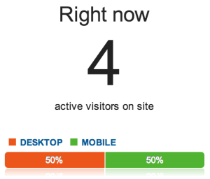
I created a new website and implemented GA-tracking. The reason for this was to make sure that no other visitors would access the site during the test. I then enabled iCloud Tabs and Chrome’s Tab feature on my Mac and iPhone. Visiting the website with Chrome and Safari (desktop versions) gave me two active visitors in GA and when I enabled each tab in Chrome and Safari on my iPhone the Real-Time data in GA showed four active visitors, which later also turned out to be four unique visitors.

So according to my small test it seems that GA treats visits across synced devices separately (Visits 4, Unique Visitors 4).

SO Answers

One of my favorite programming resources on the web is without a doubt stackoverflow.com which basically is a gamification based Q/A site for …well, programmers. I use it primary to look up different solutions, but I also try to contribute with answers as much as I can.

Since my programming skills narrows down to front-end development, more specifically HTML and CSS (and a tiny bit of JavaScript), my focus is within in these sections and as a short blog post I thought I’ll share some of my (so far) top voted answers.

/C

My Blog Statistics for 2013

I’ve spent the evening digging into Google Analytics and I thought I’ll share some stats from the year that’s gone by. But first I would like to thank you all for visiting my blog.

My most popular blog post (based on visits):
Animated Submit Buttons

.. and second most popular blog post was:
How to maintain the end state in a CSS Animation

Looking at some numbers …

New vs Returning Visitors
Returning: 71,81%
New: 28,19%

Channels (visits)
1. (not set): 54.83%
2. Organic Search: 17.18%
3. Direct: 16.22%
4. Social: 10.62%
5. Referral: 1.16%

Top 5 Countries (visits)
1. Sweden
2. United States
3. United Kingdom
4. Italy
5. Germany

Top 5 Browsers (all versions)
1. Chrome
2. Safari
3. Firefox
4. Internet Explorer
5. Android Browser

No surprises here really. But as a side note, I can mention that 48% of my visitors didn’t have Flash installed. Not bad …

And that’s that, a brief summary of my blog stats for 2013. Now I’m looking forward to 2014.